
The SiteRx Website Redesign
Timeline: October 2024 - December 2024
A website refresh which modernized and upgraded the existing website into a touchpoint that provides clarity to customers.
Problem Statement
The original website was bare, visually disorganized, and inefficient at communicating the value of SiteRx. A clear brand identity was missing, leading to customer confusion and lower conversion success.
Background
The Goals
Build a new website on a more flexible platform, with a refreshed look and feel.
To start, I leveraged a brand survey to gather info from internal teams about what the new brand design should look and feel like. The results provided a stark distinction between who we were and who we were presented as online.
Before RedesignThe original website design was lacking in memorable design choices, effective story-telling, and informative content that increases visitor intrigue.
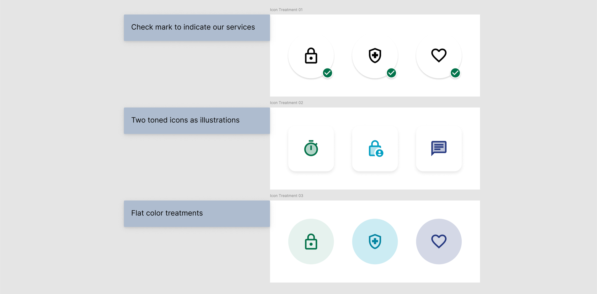
Icons, text styles, and photography were outdated and monotonous.
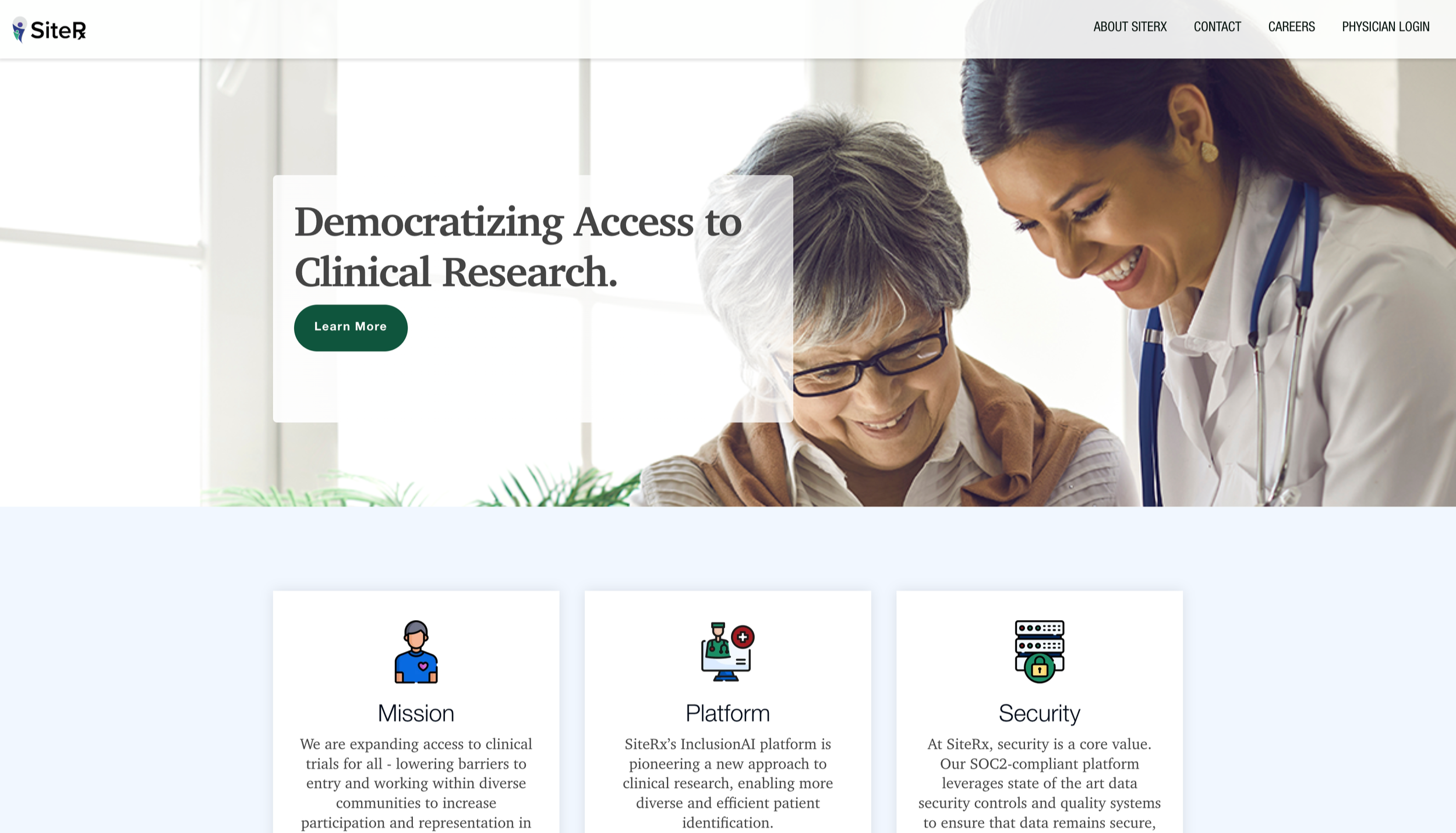
The site felt sterile and cold, conflicting with SiteRx’s caring personality
The original site was simple to the point of feeling indecipherable
Minimal Visuals
Overwhelming Text
Ineffective Story-telling
Contact forms took up more space than other content on the site
Large blocks of text could easily lose a visitor’s attention
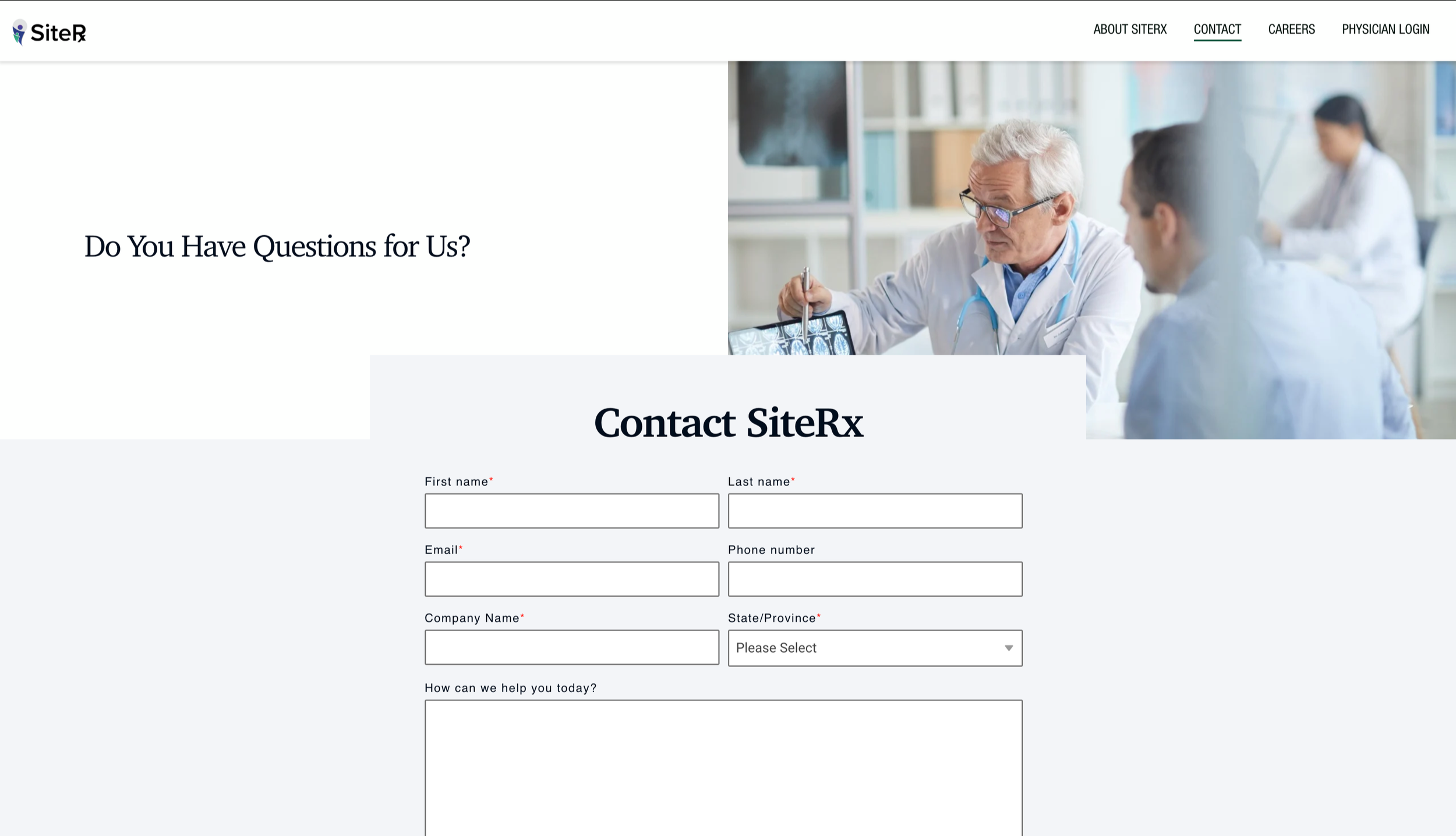
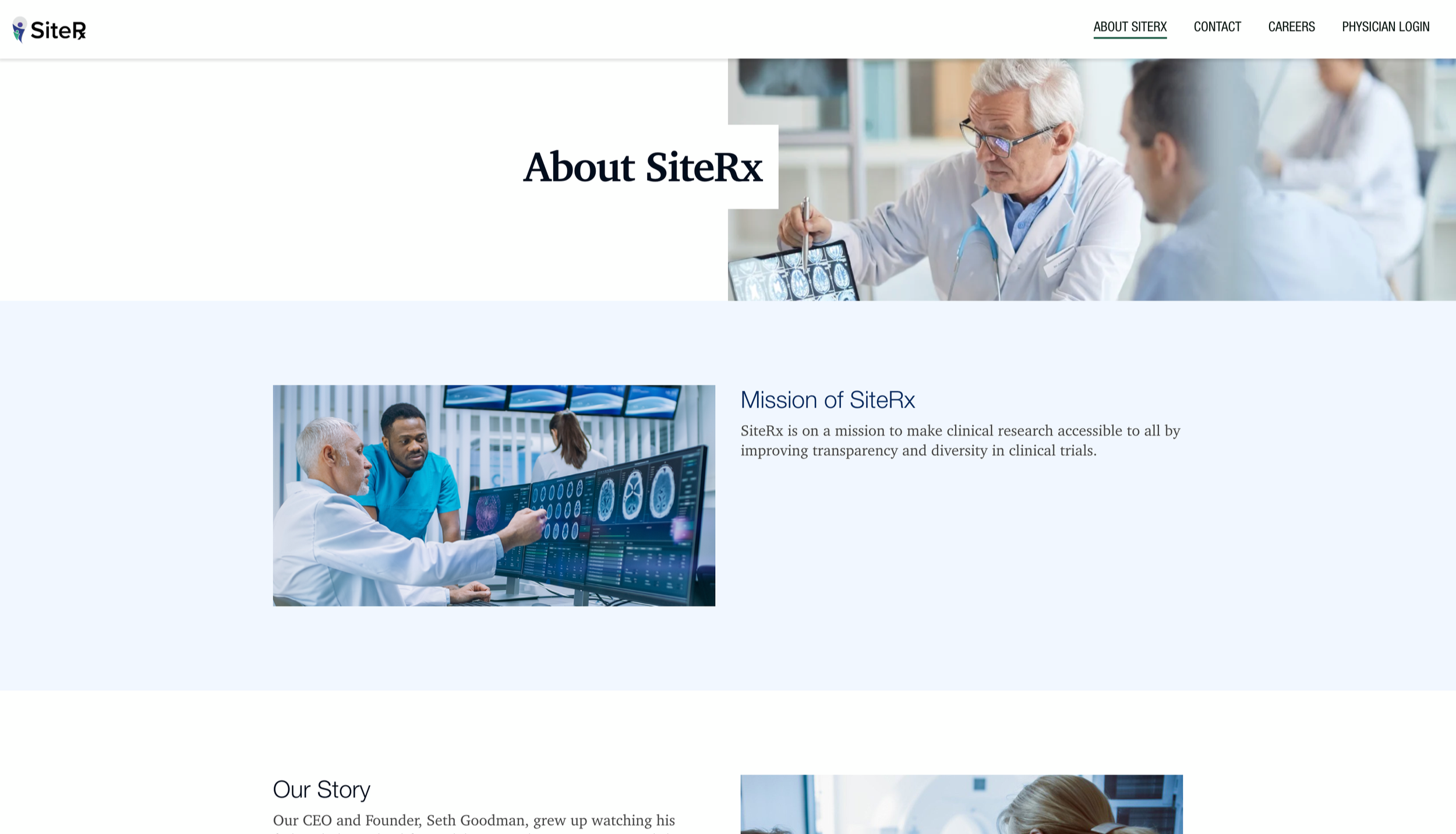
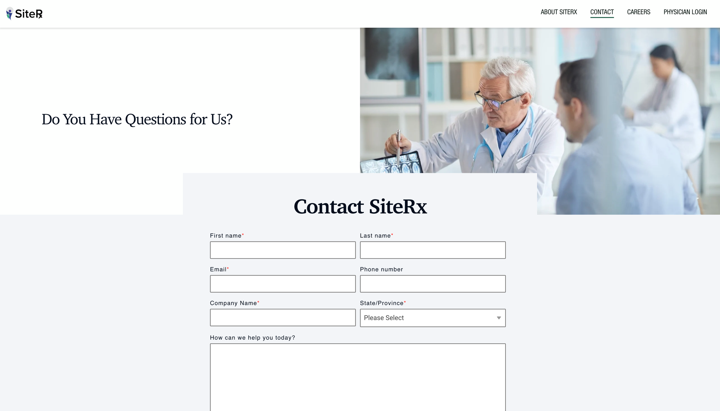
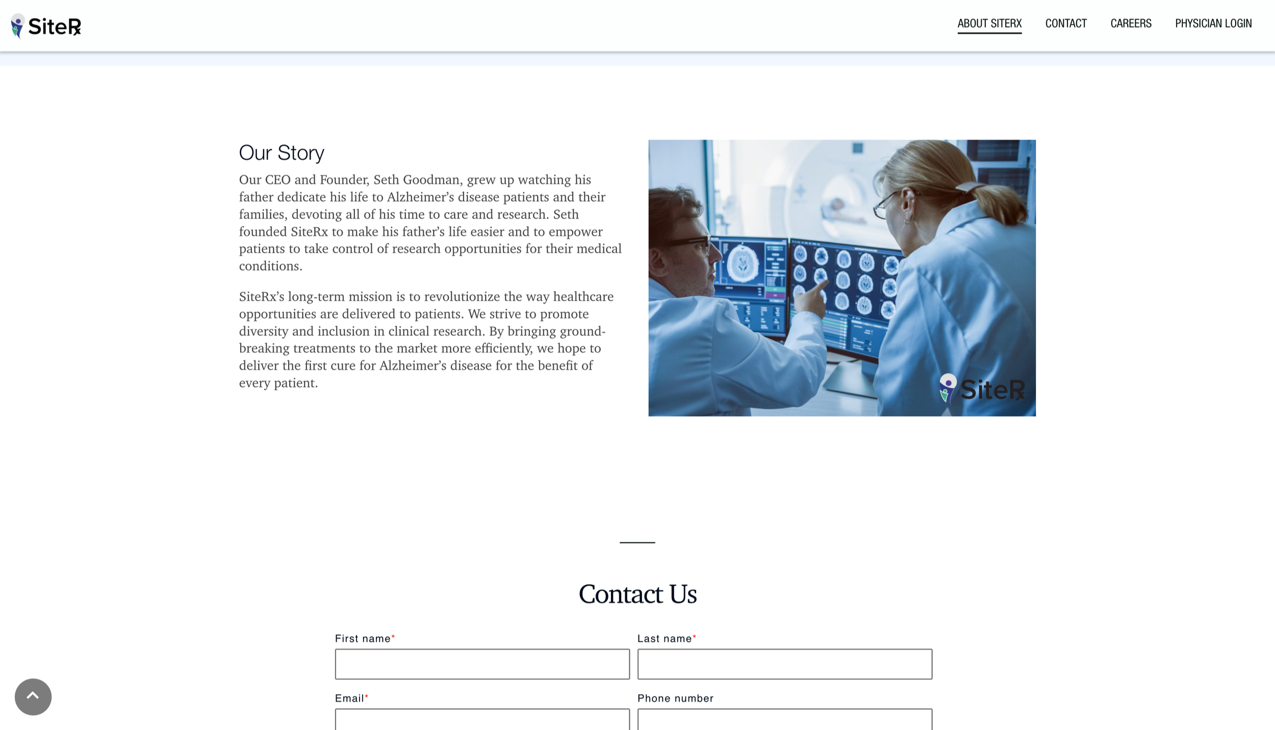
After RedesignThe new website design utilized all the same content as the original site, while filling the page more by separating blocks of text into digestible sections.
Icons, text styles, and photography are bright and cohesive.
Working with existing content while driving change
Memorable Visuals
Streamlined Text Styles
Varying Components

Curated stock photography
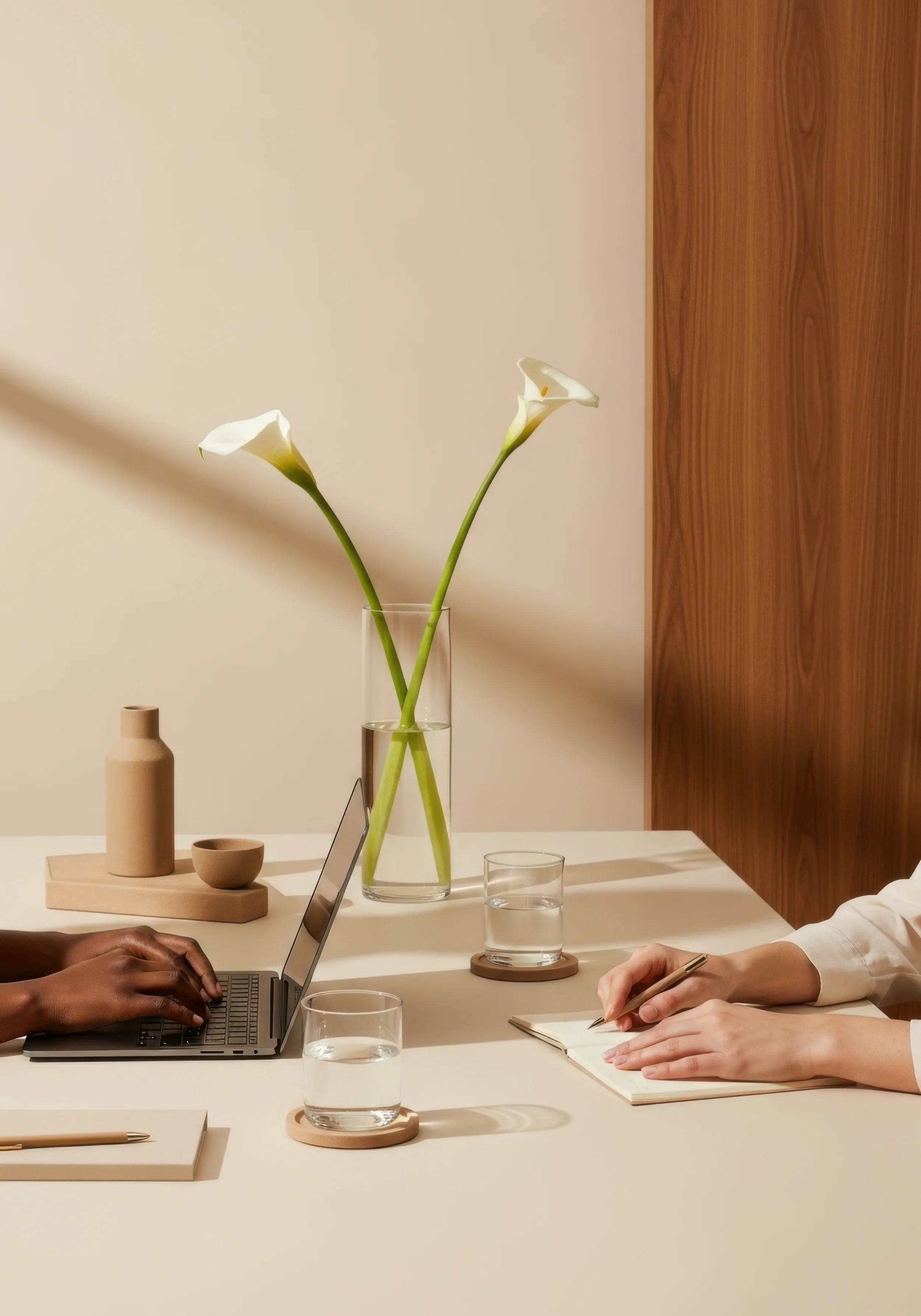
It felt extremely important that the new website’s stock photography lean into the human element of the SiteRx brand. With a modest stock photography budget and a focus on diversity, empathy, and cool toned colors, I ultimately chose a group of images that feel both cohesive and modern.


Pain Point Solutions
01
Cohesive and dynamic visuals
02
Digestible story-telling approach
03
Productive use of space
Small additions, big impact.
Improving Information Architecture
Though the content on each page remains fairly simple, spreading it out across more page sections - including subheaders and titles to introduce the focus - creates a website which feels fuller and more informative.
Refreshing the Visuals
Lively colors, cohesive icons, human-centered photography, and ornamental shapes derived from the SiteRx logo itself all breathe new life into a previously sterile website.
Clarifying the Content
Cards provide a digestible, visually interesting approach to sharing statistics or company values. The inclusion of an FAQ section brings much-needed clarity to new visitors.